Dabblet previewers
I was really impressed when I saw Dabblet by @leaverou. It's simple & fast for editing front-end code and sharing it via gists. The thing that impressed me most was the previewers, the animated pie timer & the measuring rulers in particular. These helpful little bubbles that pop up when you mouse over a keyword in CSS which give a visual representation of the values.
I poked around until I figured out how Lea created them and I wanted to share because that's what we web developers do.
The bubble itself is made up of 1 element plus two extra pseudo elements for the tick & an overlay with the border and inset shadow.
<div id="color" class="previewer"></div>
/* Cute little value previewers */
.previewer {
  position: absolute;
  border-radius: 8px;
  box-shadow: 1px 1px 8px rgba(0,0,0,.7);
}
/* tick */
.previewer:before {
  content: '';
  position: absolute;
  bottom: -6px; /* move half the width left to center */
  left: 50%; /* left edge at center */
  width: 12px;
  height: 12px;
  border: inherit;
  margin-left: -6px; /* drag left 6px (half the width) to center */
  background: white;
  transform: rotate(45deg); /* make a square a triangle */
  box-shadow: inherit;
}
/* content canvas of the previewer */
.previewer:after {
  content: '';
  position: absolute;
  /* make edges touch parent elements, match dimensions */
  top: 0; right: 0; bottom: 0; left: 0;
  border: 5px solid white;
  border-radius: inherit;
  box-shadow: 1px 1px 5px rgba(0,0,0,.5) inset;
}
I'm only going to break down two of the previewers that were particularly interesting to me.
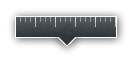
#abslength
This little ruler is created with a devilish combination of gradients, Lea explained how to create CSS3 patterns recently in her 24ways article which explains it all better than I can.
There's two main repeating gradients used to create the effect, one 20px wide, the other 5px which overlap and give the effect of the measuring stick. The background-size property sets the height of the ticks in the ruler.
<div id="abslength" class="previewer"></div>
#abslength {
  max-width: 100%;
  height: 20px;
  border: 1px solid white;
  border-radius: 0;
  transition: .3s;
  transition-property: width;
}
#abslength:before {
  bottom: -7px;
  background:
    url(noise.png),
    linear-gradient(-45deg,
      hsla(200, 10%, 20%, 0) 47%,
      hsl(200, 10%, 20%) 48%);
}
#abslength:after {
  border: 0;
  background:
    repeating-linear-gradient(left,
      transparent,
      transparent 19px,
      rgba(255,255,255,.6) 19px,
      rgba(255,255,255,.6) 20px)
      left top no-repeat,
    repeating-linear-gradient(left,
      transparent,
      transparent 4px,
      rgba(255,255,255,.4) 4px,
      rgba(255,255,255,.4) 5px)
      left top no-repeat,
    url(noise.png),
    linear-gradient(
      hsla(200, 10%, 20%, .8),
      hsl(200, 10%, 20%));
  background-size: 100% 10px, 100% 5px, auto, auto;
  box-shadow: none;
}

#time
This little guy took the cake for me. The same old previewer is used but the border-radius is bumped right up to make a circle, the animated timer itself is pure SVG with animated values. I love seeing a mix of SVG & CSS to create something simple, easily readable and flexible.
The pie shapes can be created with a combination of the stroke-dasharray & stroke-dashoffset properties on the
<div id="time" class="previewer">
  <svg>
    <circle r="15.9" cy="32" cx="32" stroke-dasharray="100" transform="rotate(-90) translate(-64 0)">
      <animate repeatCount="indefinite" dur="2s" values="-100;-300" attributeName="stroke-dashoffset">
    </circle>
  </svg>
</div>
#time {
  width: 74px;
  height: 74px;
  margin-left: -37px;
  background: linear-gradient(right,
    hsla(24, 20%, 95%, .4),
    hsl(24, 20%, 95%) 95%);
  /* half the width/height for a perfect circle */
  border-radius: 37px;
}
#time:before {
  bottom: -4px;
}
#time:after {
  background: url(noise.png);
  z-index: 2;
}
.previewer > svg {
  display: block;
  z-index: 1;
  position: relative;
}
#time > svg {
  margin: 5px;
  width: 64px;
  height: 64px;
  border-radius: 32px;
  background: inherit;
  transform: rotate(-90deg);
}
#time circle {
  stroke: hsl(200, 10%, 20%);
  stroke-opacity: .9;
  fill: transparent;
  /* just shy of width to prevent clipping */
  stroke-width: 31.8;
}
I've always been a big fan of Raphael.js for creating SVG / VML making it work all the way down to IE6. Seeing how SVG has been adopted in IE9 now and this is being heavily pushed it makes sense to figure out how to write SVG directly without a js abstraction.
SVG is certainly a useful tool in the box when needed. JavaScript only plays the role of the puppeteer for these previewers in Dabblet, tweaking the values and making it come to life. In this production, the mix of CSS3 properties (gradients, shadows, generated content, transitions) & SVG are the real stars.
Other things I've borrowed
Apart from learning some cool new uses of CSS gradients and more about SVG I've also copied and hacked code-highlight.js & prefix-free.js for use on this site. This is why I love open source.
That's all for now
I hope you found something in there that you can use in your own projects, I know I did.
Thanks Lea!